I can’t get enough of the IRender plugin for SketchUp. If that wasn’t yet clear to you, it’s about time you became a subscriber to this blog. In this post I’ll show you a few simple techniques that can really spice up your SketchUp renders. The most important technique you’ll need to really bring those scenes to life it creating, editing and tuning textures.
Holding a competition is always a good way to get people moving. So when I heard about IRender’s contest, I started up SketchUp and got working. Sadly, I never finished my entry, but I did learn a few things that can really help any one in creating nice renders.
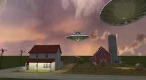
Because the idea was to create a photo realistic image, I decided to focus on an existing model and try to get that one as real as possible. My starting point was this Alien Attack scene by Jon in the Google 3D warehouse. I hear you thinking “UFOs? Great way to start a realistic render”. I know, but the idea was to get the scene looking as real as possible.
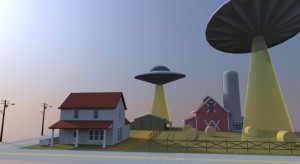
I opened the scene in SketchUp, searched a good viewpoint, loaded the IRender plugin and this was my first render (click for larger):
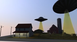
Not bad, not bad at all. If you wanted to go for a cartoony feel, I think you’d be almost done. For a photorealistic render, there were a few things that are real eyesores. But before I got to that, I wanted to play a little with the lighting. Reducing the natural light and adding a few artificial ones got me this result:
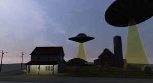
Which was a big step towards the sort-of harsh grainy look I wanted. But one thing stuck out as a major eyesore: the sky. I found the perfect SkyDome tutorial which got me to this point:
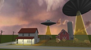
However, at that point, I noticed that IRender has many options for setting the environment. Both the sky and ground can be configured. With a texture change the result was starting to look good:
Not bad, but one thing had been bothering me from the start: those light beams under the UFOs. I searched high and low, but didn’t really find a good way to do them. It seems to be almost impossible to do good smoke effects. I also wanted a little fog in the background. But it appears to be either impossible, or at the very least extremely difficult.
So in the end I just got rid of the beams entirely. I did add some metallic translucency effects to the saucers. This slowed down the rendering times tremendously, so I never managed to quite get the effect right.
I also noticed that the hay bales were very shiny, which they are not in reality. So I tweaked those, for the final image:
That’s as far as I got. I might come back to the image. The first thing I plan to do is try out Render Plus’s RpTreeMaker to hide the horizon a little. Other things include improving the buildings in the back (maybe add a light, certainly add textures, etc.)
But as you can see, with a few tweaks and no changes at all to the model, you can really change the look of a rendered result. I’m not showing you all the stuff that look terrible, but one thing is important: experiment!
